Walk this way
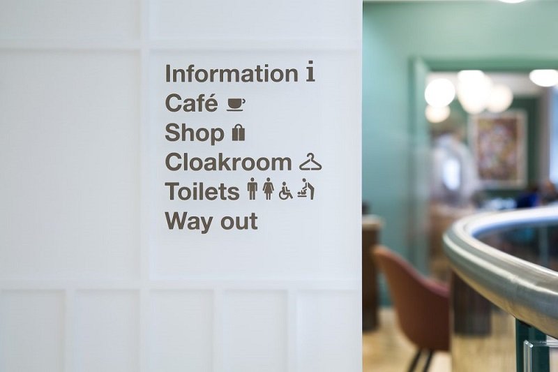
From A to B. Wayfinding is, in essence, very simple. The act of navigating, effortlessly and intuitively, from one point to another.
But as is often the case, obstacles and nuances can create complexity. As wayfinding consultants (we are a sister company to Pragma), our role is to resolve these challenges with elegance and style. One of the techniques we use to gain a deeper understanding of a scheme is to plot user journeys through a space.
Every journey begins with information
Coordinates. Data. Directions. The essential knowledge and instructions we need to get to where we want to go. We call this `progressive disclosure' – the controlled release of information, whereby we compartmentalise a journey into manageable and memorable stages. But once the journey begins, does the means of conveyance bring us to the right place? If it does, perfect. If not, we need to be somewhere else, and we need to know how to get there. Defining arrival points and the arrival sequence is therefore fundamental to our process.
When it comes to arrival, regular users and first-time visitors alike should feel any number of emotions – reassurance, pride, excitement, anticipation. What they shouldn't feel is fear or uncertainty. Upon arrival, questions arise. Are we at the right level of a building? Once we move past the welcome directory, where will we find our next cue? How do we know we are heading in the right direction?
A central focus of our wayfinding and UX strategy is the optimal placement of signs and navigational cues. But we always aim to add as few touchpoints as possible into the built environment. The architecture, narrative and experience are what draw people into and through a space. Our work must support, simplify and enhance this process.
Catering for all end users
We must also consider the needs and wishes of every possible end-user. VIPs, visitors, guest speakers, tradespeople, browsers, passers-by. Are people running late, or do they have time to take a less direct route? In educational environments, we might consider serendipitous encounters between students in between lectures. In cultural spaces, we might gently nudge people towards another exhibition or installation. The crucial point is that a building performs in ways that cater for a wide variety of needs and expectations. And it’s our job to ensure that it functions, through intelligent and relevant wayfinding, as well as possible for everyone.
These notional, top-line stages address just some of the elements within a wayfinding journey. The processes outlined above don't even touch upon design. Within a wayfinding scheme, design considerations are numerous and varied, but at all times our work must be respectful to, and align effortlessly with, the overall development. From design motifs and signature statements, through to product design and materiality, we must ensure that our work seamlessly integrates with a project’s ambitions and architecture.
Sustainability
Rightly, everyone involved in the built environment today wants to express their sustainability credentials. In this regard, a wayfinding scheme should function in two key ways. Firstly, through decisions relating to process and product. Lightness of touch through construction, for example, can help to ensure that, in 15-20 years' time, when a product reaches the end of its functional life, its materials can be reused and repurposed elsewhere. Secondly, the rigor, craft and refinement of our design means that the product we create stands the test of time – in terms of physical robustness, environmental sustainability, and enduring resolution of the original wayfinding challenge.
Accessibility
This is another key component of our wayfinding solutions. To ensure equality of access and enable as many people as possible to benefit from our schemes, we aim not only to meet industry standards, but to exceed them. At the same time, we must ensure that each scheme is context-relevant. From the time-critical navigation of a busy airport to the quiet reflection of a gallery visit, our work must be a calibrated response to the unique requirements of a particular space.
Over the next few years, we will doubtless see an increasing emphasis upon the seamless integration of digital – in terms of both personal devices that interact with a wayfinding scheme, and screens and interfaces within the sign system itself. But digital has to support the long-term goal of a project and space, enabling a wayfinding scheme to consistently perform to the same level over the course of its lifetime.
More than ever before, wayfinding brings with it a sense of responsibility. We must always design in a way that is future-fit, adaptable and updatable. We must consider a wide range of end-users and their requirements. And we must elegantly embed into architecture while striking a balance between functionality and aesthetic expression. Once we have resolved all of these challenges, we might be able to achieve wayfinding’s ultimate goal – effortless and intuitive navigation from one point to another. From A to B.
Albi Fielder
Creative Director
Holmes Wood

